Common UI/UX Mobile App Mistakes You Don’t Want to Make
Designing an app is like building a car—you have to make sure that all the parts function accurately and seamlessly if you want someone to buy it. But we’re not all perfect, and not all apps are made without a few errors.
So if you’re just starting out and want to ensure your design doesn’t break the bank or slow conversions, then it’s important for you avoid these four common UI and UX mobile app mistakes.
Seamless Onboarding
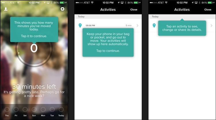
Onboarding your user from the moment they first open up your app is essential, especially if there are more than just a few features. This is where you can give your user a good first impression (or a bad one if done incorrectly). Don’t ever assume that your user knows how your app operates because what may seem simple to you may not be for someone else.
It’s fairly easy to create a few screens and arrows that explain how your app functions. However, if your users are not responding the way you want them to with your "how to" and “where to”, then you could be losing out on potential long-term customers.
There are three different onboarding styles that you could choose from. The first is value-oriented onboarding, meaning that you present the beneficial parts of your app to your users. The second type is function-oriented, where you explain interesting or technical features within your app. And the third is progressive onboarding, where you show how your app functions while your user interact with it.
Test each option, and make changes along the way to see which onboarding tactic maximizes retention rates and minimizes abandon rates.
Mobile Is Not Desktop
If you have a website for your business that you now want to create an app for, make sure that you don’t just copy everything from your desktop version onto mobile. People on smartphones and tablets use their devices and behave differently than those on desktop. Mobile users know what they want and they want it fast. As such, an app’s design needs to be easy to navigate, simple yet effective.
Permissions Are Unclear
Have you ever downloaded and opened up an app, only to find out that signing up has lead to questionable in-app permission screens? These pop-ups are vital, and may even be required for the app to function, but you must tell your users exactly why you need to "access their location" or “access the camera” (see Pokémon Go’s bad example below).

Nowadays, many mobile users are weary of providing apps their personal information, and access to their photos, location and social media accounts. In order for them to accept permission, you must explain your request clearly and accurately. This will help them not only trust your product, but also rid questionable in-app requests from your brand.
Do not, by any means, request access and never use it—would you trust someone who lied to you?
Feature Overload

Having a lot of options may seem like a good idea—more freedom, right? Not exactly. Having too many app features can lead to paralysis by analysis, frustration and app abandonment. Remember, mobile users want it easy and fast, so don’t spend more time and money integrating 100 features, when you only need 10.
A study showed that "Before use, capability mattered more to the participants than usability, but after use, usability drove satisfaction rates. As a result, satisfaction was higher with the simpler version of the product, [and] the high-feature model was rejected by most participants."
You want simplicity and efficiency, so opt for features that users enjoy the most about your app, and forget unnecessary ones that the majority won’t need.
Conclusion
Your app is everything. You’ve spent your savings, you’ve worked endless nights, and now you’re ready to send your app off into the app world. But before you hit that green button, make sure you avoid these common UI and UX app mistakes so you can dodge any pitfalls.
Providing your users with a seamless onboarding experience, offering them a mobile app that’s simple and powerful, clarifying in-app permissions and avoiding too many features will increase conversions and ROI.
Having a sleek app is one thing, but having one that’s simple, effective and fully functional is what will keep your users coming back for more.